In this article
Dashboard margins tracker graph
To view the 'Margins' graph, expand the main Chalkstring black menu bar and click on the ‘Dashboard’ menu.
Click to select the project(s) from the drop down list. Scroll down to view the 'Margins' graph in the bottom right hand corner.
Margins graph
This plotter graph tracks the profitability of the project month by month, comparing actual (solid line) against projected (dotted line) margins. It plots each periodic application margin against the current projected margin at that time, overlaying a timeline to easily identify if you are performing better or worse than the expected margin at specific points in time.
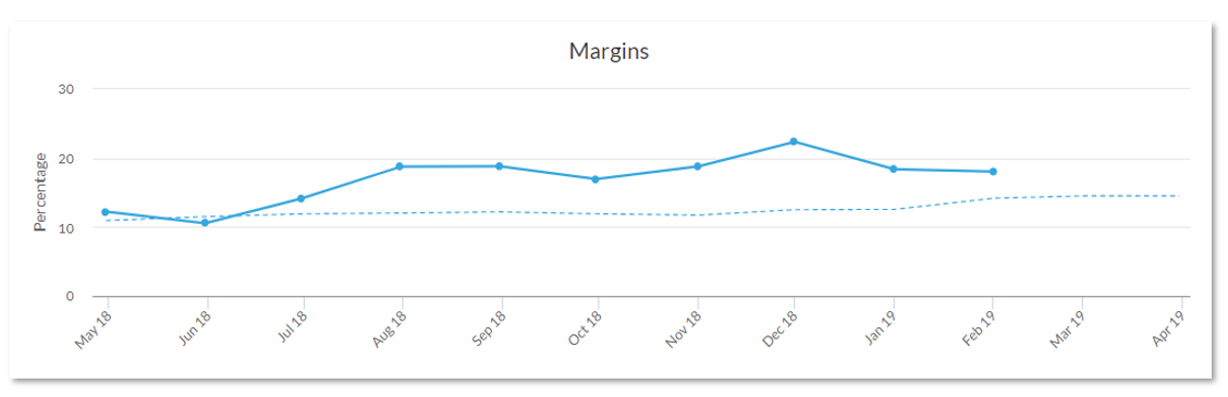
Actual margin - solid line
This line is tracked from certified revenue (actual payment received from the client) minus actual costs incurred to the effective date of the revenue plus costs accrued prior to the point of the effective date.
Projected margin - dotted line
This line is tracked from the collective assessments from each package and accumulated to an overall project.
