In this article
Interface changes and improvements
We’re excited to share Chalkstring’s latest updates designed to make your experience smoother, cleaner, and more efficient. These interface changes focus on improving navigation, decluttering your workspace, and providing you with more screen space to focus on what matters.
Here’s an overview of the key updates and how they enhance your day-to-day use of Chalkstring.
Why these changes?
These updates are part of our commitment to improving your Chalkstring experience. By consolidating settings into the 'Settings' menu and streamlining navigation, we’ve:
- Cleared up valuable screen space so you can focus on your projects without unnecessary clutter.
- Made navigation faster and easier by grouping related tools in one accessible location.
- Enhanced readability and usability with a cleaner design that reduces visual noise.
What’s Changed?
Redesigned main navigation menu
The main navigation menu has been given a fresh new look! While retaining the same familiar functionality, the updated design provides a cleaner and more streamlined experience.

This redesigned menu ensures:
- A tidier layout: The updated design reduces the number of icons within the menu, making it easier to focus on the tools and options you need.
- Maximised screen space: The compact design offers more room to focus on your project data and tasks.
- Improved navigation: The simplified menu structure ensures you can quickly and intuitively locate the features and sections most relevant to your work.
While the menu still retains the same functionality, these updates are aimed at making your navigation experience smoother and more enjoyable.
Relocation of the core databases
Your core databases have moved and are now located in the 'Settings' menu. This menu can quickly and easily be accessed from both the estimating and onsite sections of Chalkstring.
Resources menu
Previously part of the main navigation, the 'Resources' section is now located under the new 'Settings' menu in the bottom left corner of your screen. This account-wide section is easily identifiable by it's grey background colour.

This change helps centralise key tools, making it easier to access resources like product templates, quotes, and other account-wide data from any screen.
Contacts menu
Previously part of the main navigation, the 'Contacts' section is now located under the new 'Settings' menu in the bottom left corner of your screen. This account-wide section is easily identifiable by it's grey background colour.

This change helps centralise key tools, making it easier to access contacts like subcontractors, suppliers, and other account-wide data from any screen.
Admin menu relocation
The 'Admin' section has been moved! Previously part of the main navigation, it’s now located under the 'Settings' menu in the bottom left corner of your screen.
This account-wide section is easily identifiable by it's grey background colour.
This change helps centralise key tools, making it easier to access admin features like trades, roles, and other account-wide data from any screen.
My account relocation
The 'My account' section has been moved. Previously located in the top right corner, it’s now located under the 'Settings' menu in the bottom left corner of your screen.

Accounts and Dashboard
The Accounts and Dashboard sections have now moved to the lower section of the main navigation bar. This helps centralise these key areas , making it easier to access your account & report information like orders, invoices, and other various financial shared data, from any screen.
 The Accounts section is also accessible via the 'Settings' menu.
Sign out
The 'Sign out' button has been moved. Previously located in the top right corner, it’s now located in the bottom left corner of the main navigation bar.

Redesigned navigation system
We've also made improvements to general navigation in Chalkstring, some of these changes include:- The top navigation bar has been redesigned to offer a more modern, browser-like feel. Positioned higher up on the screen, it resembles internet browser tabs for a more familiar and intuitive layout.
- Key buttons now located in more intuitive and easier to locate positions. E.g. the 'Add products' button has moved from the bottom left to the top right of the screen.
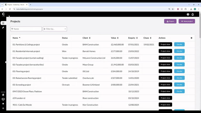
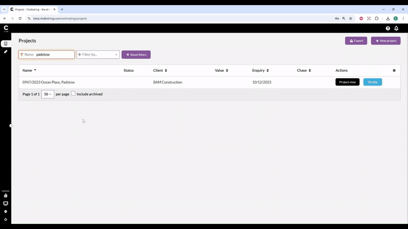
- Table styling updated to make them cleaner and easier to read.
These improvements provide more screen space for your projects and data, create a cleaner look, minimising distractions, and make navigation routes more intuitive, ensuring you can quickly locate the features and sections you need.
> Back to top
