In this article
- Understanding the dashboard
- Understanding the graphs and charts.
- The graphs and charts
- Want to know more?
Understanding the dashboard
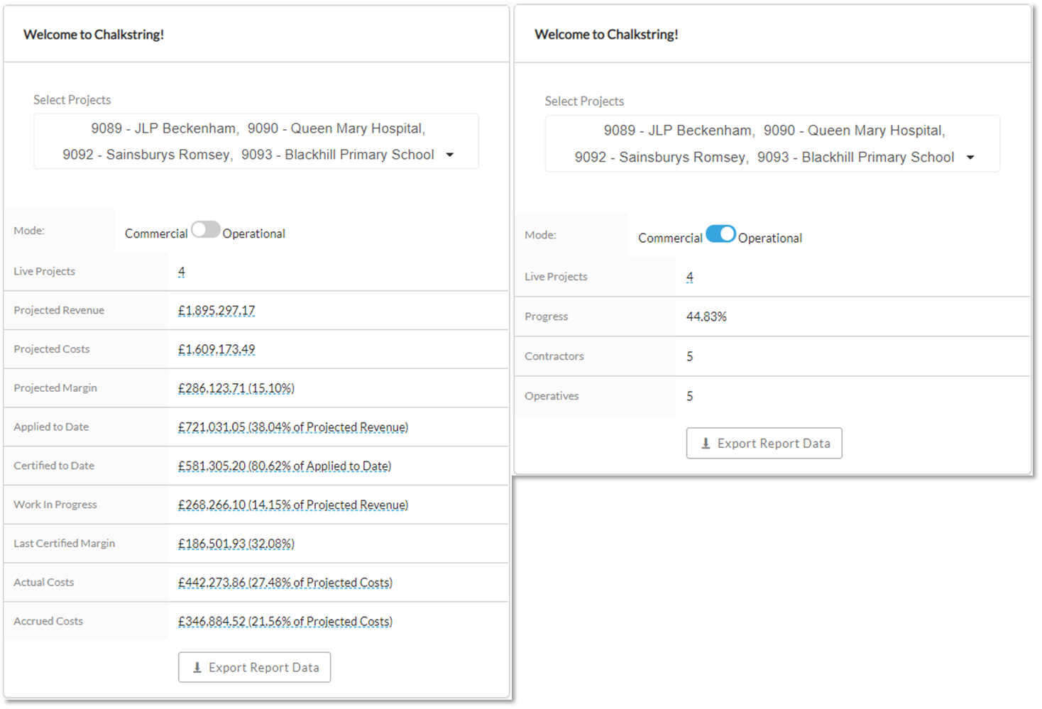
The dashboard collates and reports on the key commercial & operational data associated with the projects currently being delivered. Data can be filtered by projects and is displayed as interactive pie charts.
1. Expand the main Chalkstring black menu bar and click on the ‘Dashboard’ menu.
2. When the dashboard opens, the page will be blank. Click the ‘Select Project’ drop down menu.
3. Click on the required projects to populate their data on the dashboard.
Hovering your mouse cursor over the charts and graphs will provide additional pop up information.
4. To export this data to a spreadsheet, click ‘Export Report Data’.
5. To switch between commercial and operation metrics, click on the ‘Mode’ slider.
Understanding the graphs and charts.
- The ‘Commercial’ chart gathers the key data across all packages within a project to give an accurate real time overview of a project or grouping of projects.
- The 'Operational' chart tells you the current aggregate time progress, as well as the numbers of contractors and operatives currently logged as being on the project via the project roles functionality.
The graphs and charts
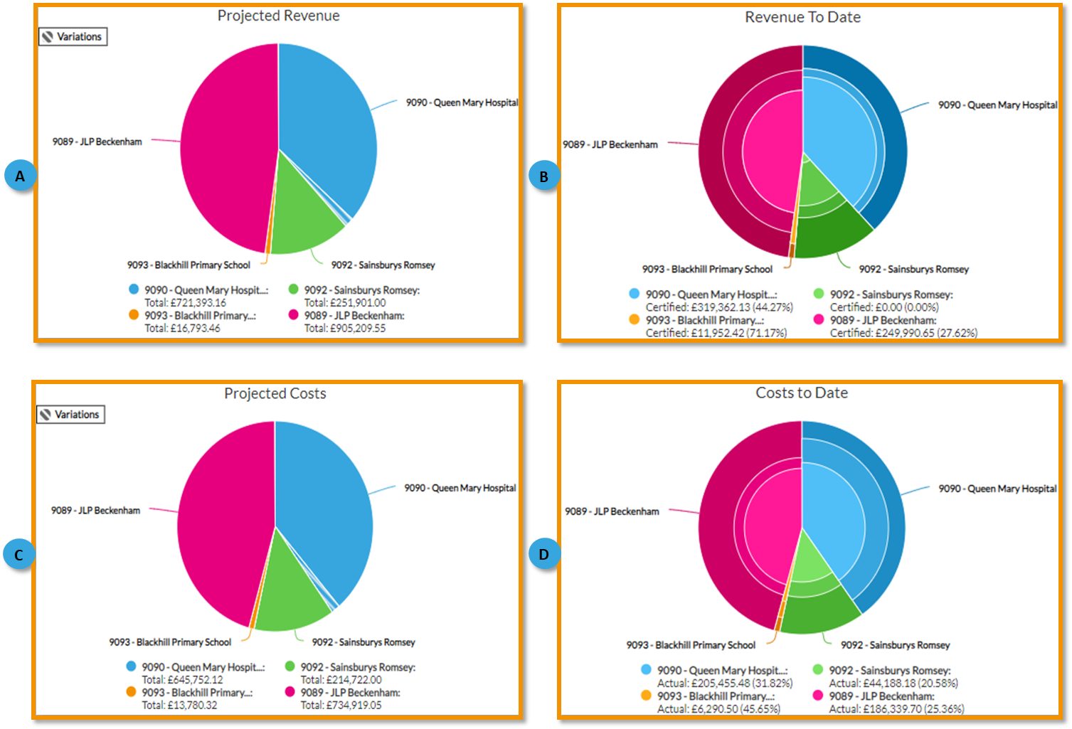
A. The projected revenue pie chart will display different information, depending on the number of projects you select to view from the ‘Select project’ drop-down. Hover your cursor over the pie for more detailed information. Each project has its own colour code. Block colour is original contract scope revenue and coloured hatched sections are the variations.
B. The revenue to date pie chart will display different information, depending on the number of projects you select to view from the select project drops down. Hover your cursor over the pie for more detailed information. Each project has its own colour code. Within each project there are shaded bands to display the certified to date, applied to date, and work in progress figures.
C. The projected costs will display different information, depending on the number of projects you select to view from the select project drops down. Hover your cursor over the pie for more detailed information. Each project has its own colour code. Block colour is original contract scope cost, the coloured hatched section is the variations.
D. The costs to date will display different information, depending on the number of projects you select to view from the select project drops down. Hover your cursor over the pie for more detailed information. Each project has its own colour code. Within each project there are shaded bands to display the actual cost to date, and accrued cost to date, in the context of the whole projected cost.
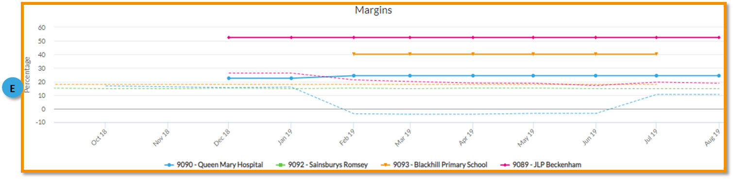
E. The ‘Margins’ chart displays actual margins as a solid colour line and projected margins as a dotted line. Projected margins are determined by how you have priced and quantified your work. Actual margins are established by tracking actual & accrued costs incurred prior to the ‘effective date’ vs certified revenues as at the ‘effective date’. The effective date is typically month end but does not have to be.
